Beige
Shopify theme for beauty businesses
- Role
- Product Designer
- Category
- E-commerce, Storefront
- Skills
- Shopify Template Design, Styleguide
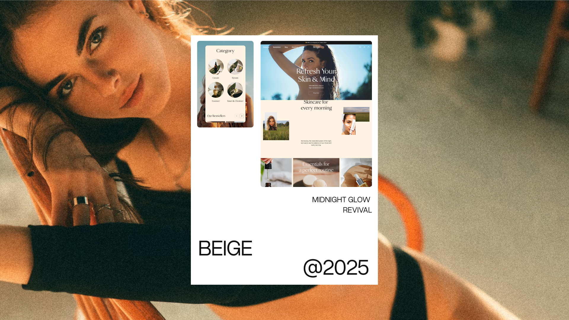
Beige is a Shopify theme for beauty businesses, built for dropshipping and classic e-commerce. Total 20 pages across 3 Figma pages, 16 component sets, and responsive pairs for screens, modals, and menus.
What I did as Product Designer in this project:
- Designed the full templates in Figma: sitemap, all pages, component sets, and styleguide. Created desktop 1280 and mobile 375 pairs for every screen, including modals and menus. Designed every state, not just happy paths — empty carts, order states, filled and empty forms.
I designed Beige from start to finish in Figma: information architecture first, then pages, then a component system buyers can reuse and restyle.
➤ Impact:
- Complete coverage: 20 pages across shop, blog, account, and info — buyers never design a missing page themselves.
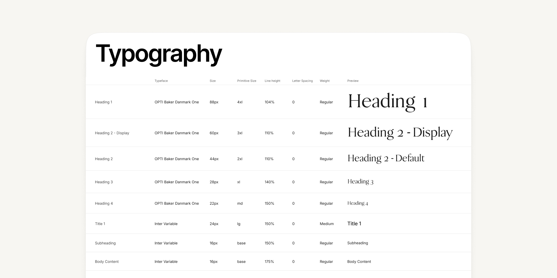
- System buyers reuse: 16 component sets plus desktop and mobile typography frames restyle the whole theme at once.
I. Problem
- Blank-canvas cost: Starting a beauty store from a blank theme means weeks of page design before the first sale.
- Missing states: Most themes polish the happy path. Empty carts, failed orders, and empty accounts ship broken or default.
- Mobile afterthought: Desktop-first themes account, and review flows onto phones where most beauty traffic shops.
- No styleguide: Without type, color, and component rules, every customization drifts — the brand breaks within months.
II. Goal
Every Shopify page a beauty store needs, designed once and reusable forever
In short: shop, blog, cart, account, search, help, and legal — each page in desktop and mobile, each state covered. What this means: buyers launch faster, customize through one styleguide, and never hit an undesigned screen.
III. Design Process
1. Preparation
Briefing: The brief came from the cover promise: all Shopify pages, creative responsive, dropshipping plus classic e-commerce, with a styleguide. Beauty niche, warm minimal look.
Scope: 20 pages across shop, blog, account, and info — desktop and mobile, happy paths plus empty and error states.
2. Research & Analytics
User Interviews: The research base is Shopify's fixed page model, the sitemap as the coverage contract, and the beauty niche's warm minimal visual language.
Benchmarks & Data: We reviewed how Shopify structures every store: home, catalog, product, cart, checkout, blog, account, policies, search, and 404.
Checked against Baymard Institute's public findings: carts need upfront totals (23% of shoppers have abandoned orders without one) — the cart modal totals even at $0 with a free-shipping progress bar and a start-shopping path;
Autocomplete lists stay manageable with scoped suggestions (desktop ≤10) — the typing state shows scoped suggestions plus recent searches on desktop and mobile;
Desktop filters persist in a left sidebar with visible Filter and Clear All; reviews carry image variants.
Hypothesis: If every page, state, and breakpoint ships designed and systematized, beauty sellers will launch faster and stay on brand longer than with assembled parts.
3. Prototyping
User flows first, testable screens later.
- Shop loop: Homepage → listing with category filters → product detail with ratings, badges, and descriptions → cart modal with upfront total, free-shipping progress, and start-shopping path → checkout.
- Account loop: Sign in or up → address book → order history → order detail across four states (completed, fulfilled, unfulfilled, returned) → write review, filled or default.
- Discovery loop: Search modal with default, recent-search, and typing states plus scoped suggestions → product listing / product detail.
4. Visual Design
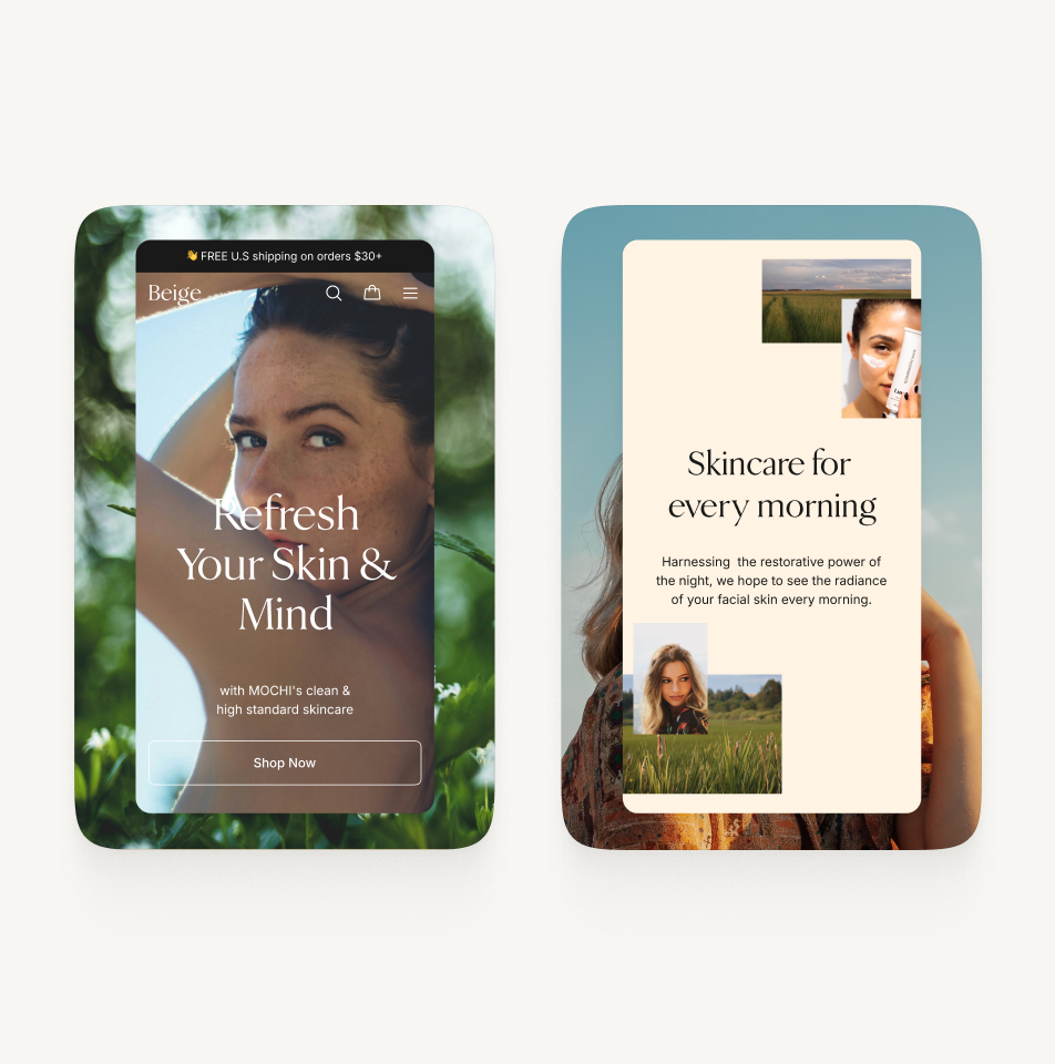
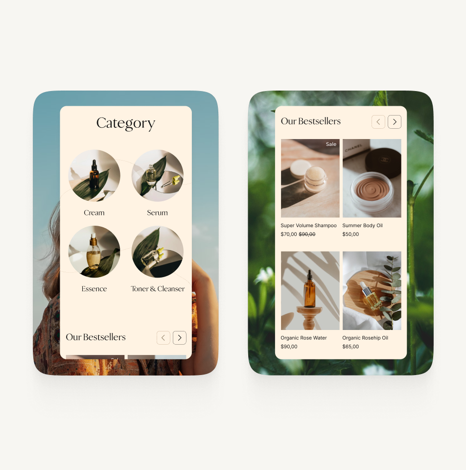
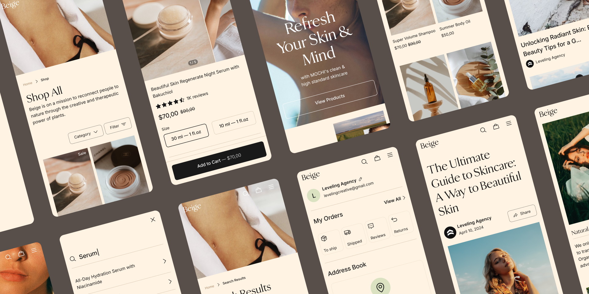
- Warm minimal system: Cream and beige surfaces, serif display headlines with clean body text, beauty photography throughout — premium without coldness.
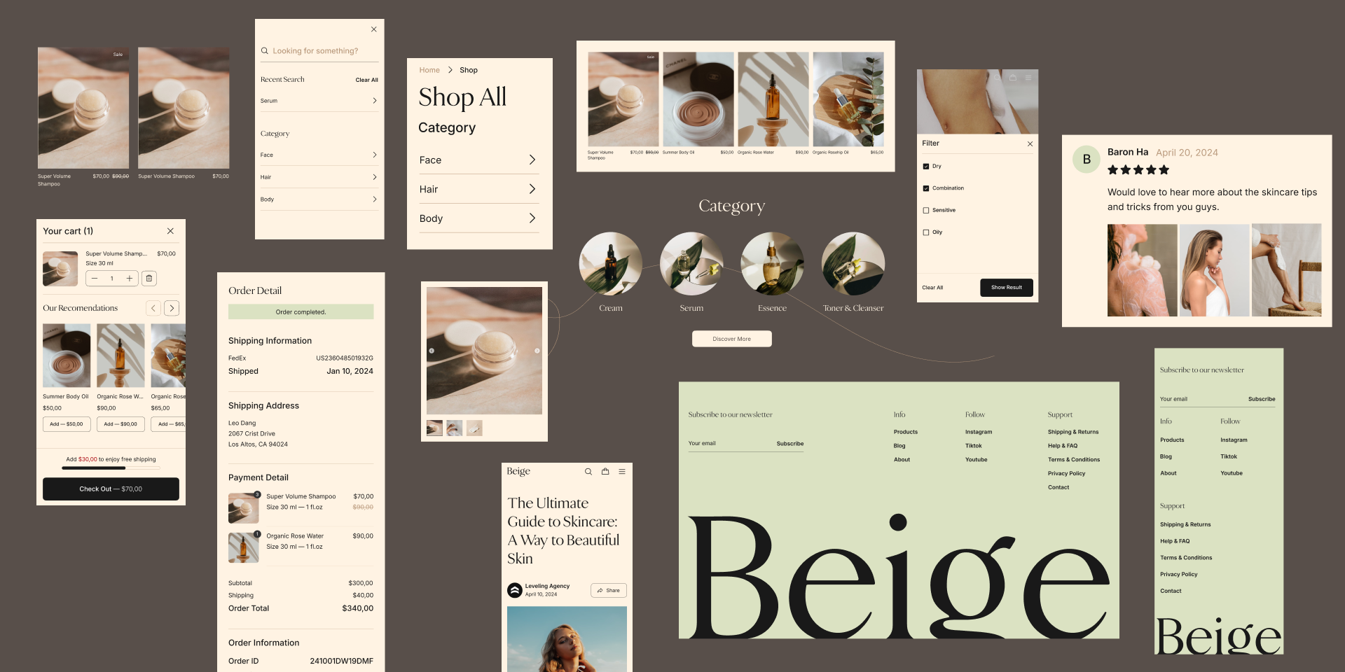
- Commerce components: Product cards with ratings and badges, category filter pills, review and comment blocks, avatars, breadcrumbs, and sidebar navigation.
5. Testing & Finalization
- Sitemap coverage (internal): Every sitemap node traced to frames: 20 pages found across Main Pages and Account plus Info, desktop and mobile.
- State coverage (internal): Empty cart and empty orders, four order-detail states, filled and default reviews, empty/typed/filled address forms — no default screens left.
- Responsive parity (internal): Desktop 1280 and mobile 375 pairs for screens plus modals and menus — checkout, account, search, and reviews all adapt.
- Component consistency (internal): 16 component sets (navbar, buttons, cards, footer, review, sidebar, icons, and more) plus desktop and mobile typography frames — one change updates every page.
- Handoff specs: Sitemap diagram, styleguide frames, component sets with variants, and desktop/mobile type scales — a buyer or developer starts from structure, not screenshots.
6. Measure & Iterate
- Default states → designed states: Empty and error screens ship broken in most themes. Beige designs empty carts, empty orders, and all four order states as first-class screens.
7. Scale
I design for scale with a clear system: design systems and component-driven design for long-term impact.
- Scalability: 16 component sets repeat across 20 pages — navbar, buttons, cards, reviews, footer, and more. New pages assemble from parts, never from blank frames.
IV. Outcome
1. Design Solution
Complete beauty theme: full page coverage, warm minimal system, and buyer-ready handoff in one file.
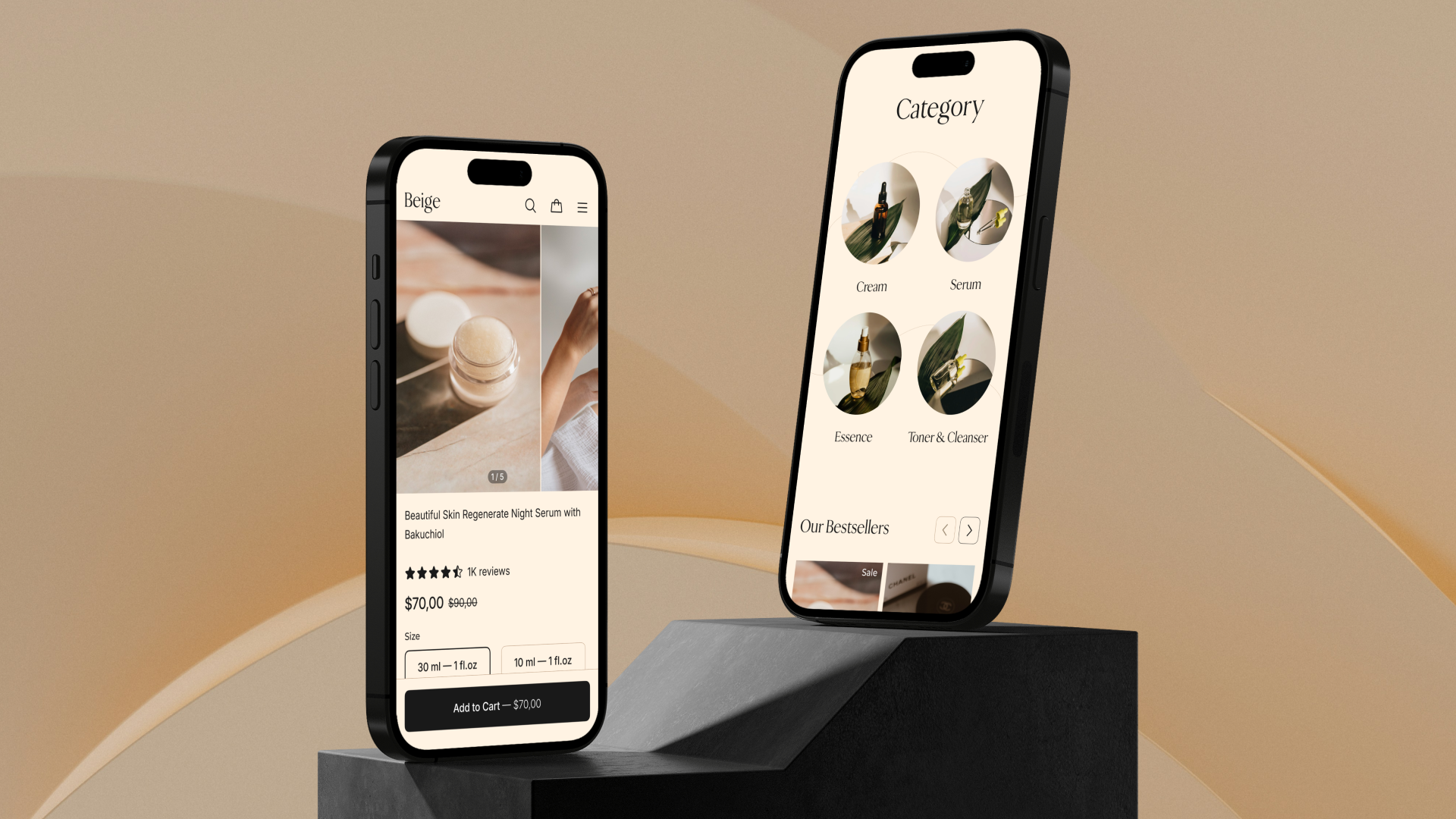
- Shop: homepage, listings with filters, detail with ratings and badges, cart, checkout
- Content: blog listing and detail, about, contact, help and FAQ
- Account: sign in, address book, order history and detail, reviews
- Trust and legal
- Search and 404
- Shipping and returns
- Privacy and terms
2. Testing
Design repeats: missing pages drawn, default states designed, mobile pairs added — each answering the file's own coverage check.
3. Results
A theme file that sells completeness: coverage you can count, states you can click, and a system you can restyle.
- Sitemap and frames match one to one — coverage is checkable, not claimed.
- State-heavy areas (orders, reviews, addresses) ship all variants.
- Typography and components centralize every future change.
Stats
- 20 pages across 3 Figma pages
- 16 component sets
- Desktop 1280 plus mobile 375
- 4 order-detail states
V. What I Learned
- Sitemap first, screens second. The sitemap diagram became the coverage contract. Every frame traces to a node — nothing extra, nothing missing.
- Design states, not screens. Empty, filled, failed, and returned variants took as much care as happy paths. That is where buyer trust lives.
- Pairs beat pages. Every screen shipped as a desktop plus mobile pair from the start. Retrofitting responsiveness costs more than designing it twice once.