HapoStudio
Live SitePractical coloring cohort course
- Role
- Design Engineer
- Category
- Education, Online Course
- Team Size
- Solo — design plus development
- Skills
- Web Design & Development, Art Direction, Data Analytic
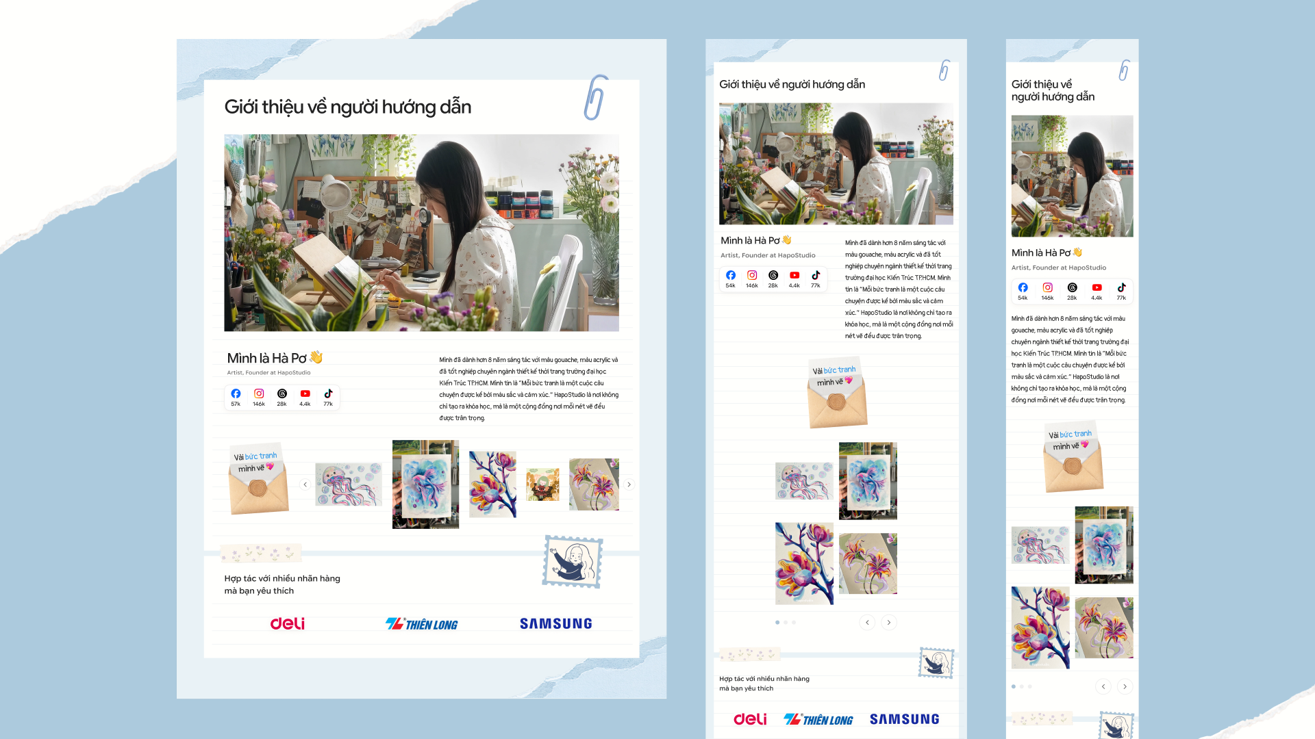
HapoStudio is the art studio of artist Hà Pơ — 8+ years painting in gouache and acrylic, graduated in fashion design from the HCMC University of Architecture. She believes every painting is a story told by color and feeling, and runs the studio as a community where every stroke counts. Over 200 students have enrolled. About 312k people follow her across Instagram (146k), TikTok (75.8k), Facebook (57k), Threads (28.6k), and YouTube (4.5k).
What I did as a solo Design Engineer:
- Designed and developed the course website end to end: curriculum browser, format explainer, pricing card, instructor bio, testimonials, and FAQ
- Built it as a Next.js + TailwindCSS site with a paper-craft visual system — pins, tapes, stamps, torn paper, and playful stickers
- Shaped all page copy around real student questions, with enrollment through Messenger and cohort deadlines
I designed and built the HapoStudio course site from start to finish: a single page that teaches, proves, and enrolls.
➤ Impact:
- One page enrolls: Curriculum, format, price, teacher, reviews, and FAQ in reading order — ending at a Messenger signup with cohort deadline.
- Small cohorts, personal feedback: Max 15 students per intake, video corrections per student pace, and exercise paper shipped free to the home.
I. Problem
- Repeated manual answers: Every student inquiry meant resending the same course images and descriptions, one chat at a time.
- Scattered information: Curriculum, price, reviews, and dates lived across Messenger chats and social posts — no single place to point to.
- Scattered trust: Credentials, brand work, reviews, and student paintings spread across platforms, never assembled at the moment of decision.
II. Goal
One link that answers, proves, and enrolls — ending repeated manual replies
In short: stop resending the same course images in every chat. Send one link with the full curriculum, the teacher, real student work, the price, and every answer.
What this means: a learn loop for browsers, a trust loop for undecided readers, and an enroll loop with Messenger signup and cohort deadline.
III. Design Process
1. Preparation
Briefing: The studio needed a course site that sells the Practical Coloring course: curriculum browsers can verify, a teacher they can trust, reviews they can believe, and a price with a deadline. I mapped the reader journey first: learn, trust, verify, enroll.
Constraints: What I took in: solo design engineer — design and code by one person. Vietnamese beginners as readers, so plain words and pictures carry the page. No checkout system — enrollment runs through Messenger chats. Exercise paper must physically ship to students.
2. Research & Analytics
Benchmarks & Data: We reviewed how the studio already taught and sold: social posts, Messenger chats, and word of mouth. Baymard Institute's public findings back this layout. 56% of shoppers inspect images first, so every claim sits next to its photo. Thorough descriptions decide purchases, so the curriculum shows minutes and goals per lesson. Reviews work harder with images, so testimonials carry message screenshots and avatars.
Hypothesis: If one page answers every beginner fear — with a visible curriculum, a trusted teacher, real student work, and personal corrections — browsers will enroll instead of bookmarking and forgetting.
3. Prototyping
User flows first, testable screens later.
- Learn loop: Hero promise → value props (theory, steps, mixing, creativity) → intro video (19 seconds) → curriculum browser (3 parts, 10 lessons, minutes each). One link replaces re-sent images.
- Trust loop: Student count → named reviews with message screenshots → instructor bio with credentials and social reach → brand collaborations → teacher's art gallery.
- Enroll loop: Format cards (video, corrections, shipped paper, max 15) → price card (2,200,000 VND with VAT, deadline, opening day) → Messenger signup.
4. Visual Design
- Paper-craft system: Torn paper, pins, tapes, stamps, paper clips, and playful stickers hold every section — a desk you want to sit at, not a template.
- Playful headers: Big condensed section titles with sticker decor, polaroid-style headings, and a receipt-style price card with crown and strawberry.
5. Testing & Finalization
One proof per claim, taken from the live page — not staged metrics:
- Format proof (internal): 10 close-up video lessons to rewatch, corrections per student pace, paper shipped free, max 15 per intake — each format card pairs its promise with a photo.
- Price proof (internal): One price with VAT, one deadline, one opening day, one Messenger button — no tiers to compare, nothing to misunderstand.
- Handoff specs: Single-developer build, so specs lived in the code: Next.js image pipeline, section anchor map, reusable paper-craft decor set, and testimonial gallery data.
6. Measure & Iterate
I integrated PostHog as analytic tool to measure results for this website. We track how key numbers change and find out why.
- Blind spots → basic analytics: PostHog event triggers on the signup button and video thumbnails show what readers click before they enroll: 158 viewers → 13 registration clicks (8.23%) within 14 days.
- Deadline day → traffic spike: Visits spike September 8–9 around the enrollment deadline and opening day — the cohort calendar drives traffic.
- Same ask, many doors: Registration clicks arrive from several button placements across the page. PostHog splits them by entry point — placement-level data guides the next iteration.
7. Scale
- Scalability: Paper-craft section kit, curriculum browser, price card, testimonial wall, and FAQ accordion repeat for every future course — the footer already lists the next practical coloring course and gallery as upcoming.
- Platform direction (roadmap): The same foundation grows into the next courses.
IV. Outcome
1. Design Solution
Course website that teaches, proves, and enrolls in reading order: curriculum, format, price, teacher, reviews, questions.
- Curriculum browser: 3 parts, 10 lessons, minutes and goals shown
- Format cards: close-up video, personal corrections, shipped paper, max 15
- Trust stack: student count, named reviews, instructor bio, brand work, painting gallery
- Enrollment
- One price with VAT
- Deadline plus opening day
- Messenger signup
2. Testing
Does it really work? The page answers the ten questions beginners actually ask — talent, starting point, muddy mixing, harmony, paints, flat work, seeing color, timelines, formulas. When unsure, we matched a section to each fear.
Design repeats: method before gallery, proof before signup — each in the order a doubting beginner reads.
3. Results
A complete enrollment loop for a practical skill, proven by enrolled students rather than promises.
- Full curriculum visible with minutes before any signup ask.
- Every format promise paired with a photo of how it works.
- Teacher trust carried by credentials, work, brands, and audience.
Stats
158 viewers → 13 registration clicks (8.23%)
-1.webp)
V. What I Learned
One person can ship the whole loop. Combining design and code as a design engineer is deeply rewarding! It helps me deepen my design skills while giving me a genuine understanding of how engineers think, leading to much better cross-functional teamwork.